


I Can't Stop Thinking About The Polly Pocket Compact Airbnb Experience
negotiations of scale in the toy-verse
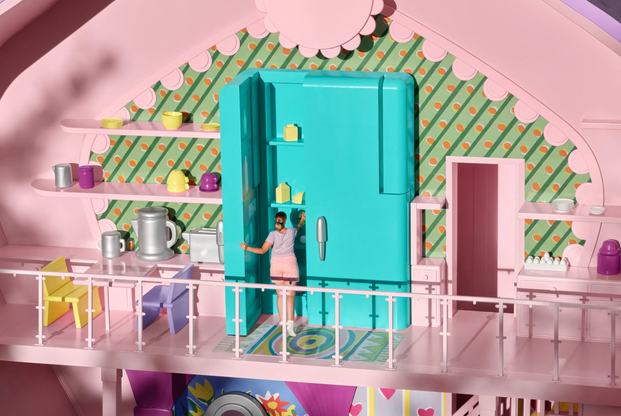
More specifically, I can’t stop thinking about the fridge at the Polly Pocket Compact Airbnb Experience. Even more specifically, I can’t stop thinking about this image of the fridge in particular:
If you haven’t looked into Airbnb Icons, I have a fun little rabbithole for you. I took a look at the listings for the first time last week. They are, of course, a bit gimmicky, a bit transparent in their marketing agenda—their existence is an extravagant symptom of the ever-present Nostalgia Epidemic that plagues pop culture, doing so with feverish intensity in the last decade or so. All of that being said, the experiences (for the most part) do intrigue me. They make me curious, in new ways, about architecture and place, and the ways that places never visited can leave deep impressions on the mind. But none of them have captivated me like the Polly Pocket Slumber Party Compact.
It’s one of the most thoroughly photographed Icons experiences listed on Airbnb, and the photographer did a great job of playing with the design: ergo, the fridge photograph. I am a prisoner to this fridge. My brain won’t let it go. The image is haunting to me, borderline uncanny. The lighting has a lot to do with it: the image was taken in natural light, with the sun low on the horizon, but the sharp, nearly-perpendicular shadows contrasting with the flat, even lighting makes it look stadium-lit. The only hint as to the surrounding context is in the sparse tree-branch shadows, which don’t look quite tree-branch-y enough. Superimposed onto what is presumably an interior space, rendered with simple shapes and flat, limited colors, it’s already a recipe for a mildly unsettling image. But then, of course, we have the human figure standing in front of the gargantuan refrigerator. The doorway to the right seems normal, but the pitcher on the left countertop is the size of the woman’s torso. It’s nearly impossible to get a read on the table and chairs. The image is a scale puzzle, overlaying a handful of contradictory spatial relationships to dwarf the figure and, in turn, the viewer. Well, I don’t want to speak for you—it dwarfs me, at least.


The whole design for the compact plays with this spatial ambiguity. The listing features quite a few photos of human hands reaching for objects in the space, all of them just a touch overinflated, their sharp edges rounded smooth. Much of this is pulled straight from the original Polly Pocket design concept, which was also one big negotiation of scale. Polly’s belongings had to be small enough to fit inside a ~3.5x4” compact case, but not so small that they couldn’t be played with. Their simplistic design is I’m sure in part attributed to the scale, as well—the Polly of the 90’s wasn’t even an inch tall, so there was only so much detail you could reasonably expect when it came to her tableware. The design had to bridge the gap between child hand and doll hand.
Still, I keep coming back to the fridge. Publicity around the experience calls the compact “life-size,” a term that has, in the course of this investigation, become my natural enemy. The term life-size, to me, implies a 1:1 Polly:Human scale across the board, but I couldn’t help but feel like there is just no way the fridge in the original compact is that big relative to everything else. Like, there’s just no way that the top of Polly’s little plastic ponytail didn’t even come halfway up her refrigerator. I didn’t have the toy, though, and photos of it online are limited. In fact, I have yet to see any documentation of toy Polly standing next to her toy fridge at all. So I started by comparing a photograph of the Airbnb compact and the toy one (also from the listing) side-by-side.


The side-by-side (and eventually one-on-top-of-the-other, thank you Photoshop) comparison did reveal a few sneaky things about the Airbnb compact, most of which concern the compact’s approach to structure and code compliance, which I do find interesting all by itself. Most notable from the get-go are the addition of railings (which could have been an eyesore but were made lightweight by the use of something like plexiglass under the top rail), as well as the two load-bearing columns in front. My brain filtered these columns out at first, which meant that a little while after I closed the browser window I nearly blew a fuse trying to figure out how they’d cantilevered the upper deck. The overlaid comparison also helped me to notice the doorway next to the fridge, which, like the other elements added for structural functionality, are painted the same pink as the inner shell and tend to kind of fade into the background. I can’t for the life of me find the name of the architect who adapted the design, but I’d love nothing more than to see the drawing and permit sets for this thing.
The addition of the doorway seems like a sacrifice of consistency in one area for the sake of another: in the toy compact, the staircase goes up to the second floor and ends at a dead wall with no landing. Polly Pocket can simply leap over the gap to the kitchen with the power of imagination magic, but we humans are not so lucky. The size and placement of the stairs make them an important visual element in the original design, though, so I assume the desire to maintain consistency there warranted some scooting-around on the upper floor to provide a functional, if hidden, staircase.
Additionally, the side-by-side helped to visualize the scalar inconsistencies between the toy and “life-size” cookware (some of which are, in fact, life-size, but others of which are not). There’s notable variety in the faithfulness of scale here: the torso-sized pitcher sits next to a torso-sized toaster, but on the shelf above them is a stack of plates you could probably buy at Crate + Barrel. These incongruencies were helping me to get closer to the problem of the fridge, but they were simultaneously complicating my understanding.
So I made some diagrams.


These probably aren’t 100% accurate elevation drawings as I only had photos to go off of1, but it’s a good-faith representation of each of the spaces, with relative size accuracy. What is immediately apparent is that Polly looks right at home at the scale of her space. She is a normal height relative to her refrigerator. It honestly seems cozy! Here, I’ll even put a Polly-scale human figure in the drawing so you get a feel for it.
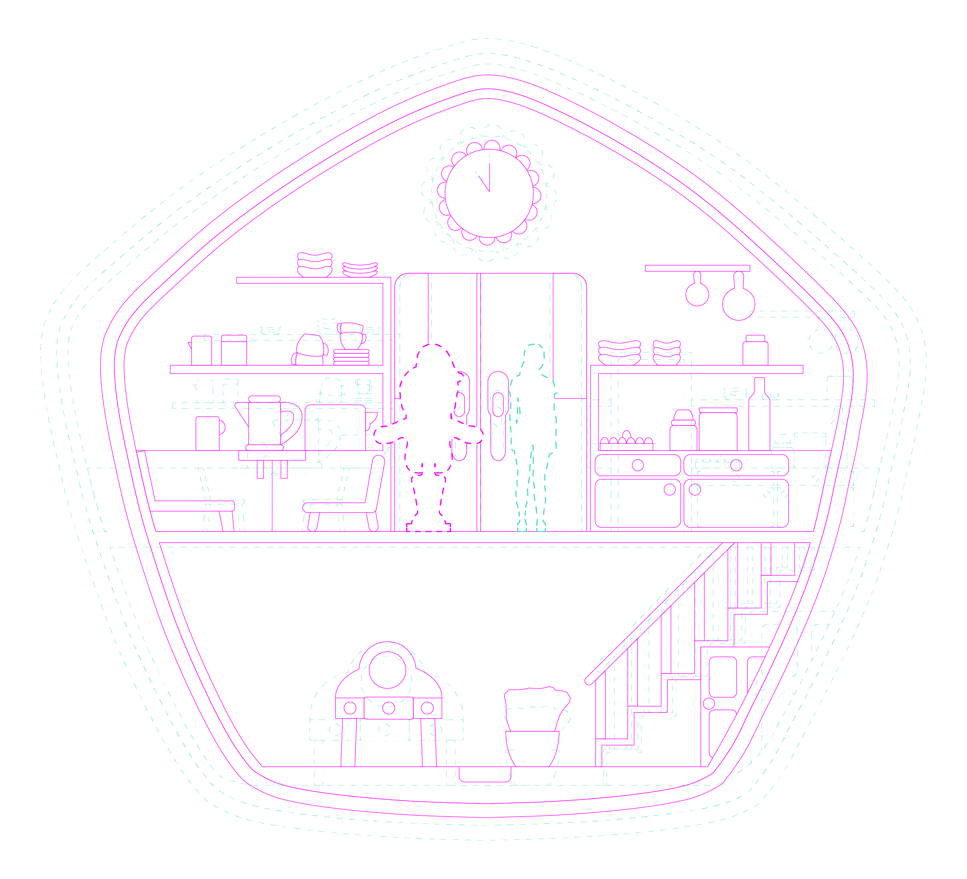
Where the toy version seems cute and homey, the Airbnb version kind of dwarfs the figure all-around. The space just feels more cavernous when you put it next to Polly’s compact. I’ve scaled both drawings using the fridge as an anchor, so the differences in everything else are that much more apparent. Much of the toy compact’s visual interest comes from the objects on the shelves. In the “life-size” version, many of these objects become microscopic, and a lot of the texture they lend to the toy gets lost. It’s a weird inversion of the original downscale: everyday objects were made into tiny toy versions relative to their user (Polly), and they make sense in Polly’s space. Now that we’ve scaled Polly’s compact back up, those same everyday objects were again adapted for the user (a human), but now they appear strangely small. In a 1:1 equation, everything should work as naturally as it does in the toy compact, so it’s reasonable to assume that this wasn’t a 1:1 upscale.


Some numbers for you: in 1994—the year that Bluebird Toys released the Polly Pocket Slumber Party Fun Compact—Polly Pocket was just shy of 1 inch tall. The compact is approximately 4 inches tall, so Polly is around 1/4 the height of her compact. The Airbnb compact is 42 feet tall, and for the sake of consistency, we’ll call it 504 inches. The average height of a human female is 63 inches, meaning that the person in the fridge photo is 1/8 the height of the compact. This makes the toy:Icon ratio not 1:1, but 1:2, meaning that Airbnb doubled everything up for their “life-size” rendition.
Other than sheer spectacle, there are a few reasons I can think of that they might have done this. Practically, more space allows for structural additions that obviously weren’t required in the toy. The space had to get wider to accommodate the doorways to the second staircase, which needed to be concealed off the back for consistency with the original design. Similarly, the clearance height on the bottom floor is pretty low in the toy version—Polly’s ponytail nearly scrapes the ceiling. Airbnb also wanted to accommodate four guests at the experience, whereas the original toy was only comfortably big enough for two. I get it; the Slumber Party Compact is a group hang, not a couple’s retreat.
The result of these scalar negotiations ultimately leaves us with a goliath fridge, but part of me kind of thinks that’s the point. It’s rooted in that Nostalgia Epidemic I mentioned earlier—the reality of scale is less important than the memory of it. The lasting impression of Polly Pocket is that she was small. And she is! Even if she wasn’t that small. To be dwarfed by the Polly Pocket compact is to be utterly immersed in the world of the toy; it’s a time-machine back to childhood. This is ultimately why I think the compact is a success. Hard as I try to understand the equations that built it, its inconsistencies are subtle, and I imagine that in the moment, rooting around in Polly Pocket’s fridge while the sun sets behind the trees, they’re hardly there at all.
I also got measurements for the compact from onlypollypocket.com. I urge you to click the link… a capsule from the internet of old
This was a joy to read. The fans need more hard hitting architectural analysis immediately